 Super Size Saturdays
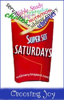
THANK YOU to Kate and Liz who have played around with my ideas and created a visual graphic. Thanks to Cindy who came up with the idea of topics I may write on spewing out of the box...I was stuck with the gruesome picture of children's faces. Thanks to all who are so encouraging.
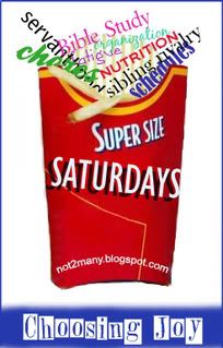
I may yet get a post up today, but regardless, help me vote on the graphic you like best. They sent me oodles and these are my top 3 favorites.

Choosing Joy on the box is too much script.....what do you think about the blue box with the blog title? Of course life would have been simpler if I'd thought about it and set the blog up as choosingjoy.blogspot but I didn't. ::snort::


©2008 D.R.G.


5 comments:
Ok. this is a HARD ONE! I think I like the simplicity of the first one because Choosing Joy at the bottom doesn't tell me anything... Now if you added "brought to you by Choosing Joy" or something then that would at least tell me what the Choosing Joy is all about... kwim?
If I had to pick between the bottom 2 then I think for you I would do #2 because the font fits your blogsytle better than #3, but I personally prefer #3 and think it fits great with the style of the rest of the logo!
But I really think I'm drawn to the simplicity of #1. When I look at the other 2 it's like my eye doesn't know where to go... does that make sense? I'm drawn to the dark blue Choosing Joy, but again, it doesn't tell me anything about the above and when I look at just the above I'm distracted by the dark blue below (LOL)!
Just call me weird (LOL)! But you did ask for comments so there are mine.
How funny, I was thinking the same thing Cynthia wrote. I prefer #1 without Choosing Joy at the bottom. I too felt it made things too busy. You do have your blog addy on it as well, so that is all I would use, but again just my opinion.
Great graphics though. Love it!
LOL I agree with you both about number one - and yet the purpose of having Choosing Joy on the logo somewhere is that it ties back to this blog. The URL does that but most no longer link to me as "not2many" - they link to me as Choosing Joy.
The problem too will be (as you will see when I shrunk the logo to fit a post) that the URL gets lost.
Ultimately I should have it as a clickable graphic so others could put it on their blogs and when clicked it would come back to Choosing Joy.
Thanks for the input... I think adding "brought to you by" would make it too script heavy.
My choice will be, I think, to use either the URL or the blog title but not both. Since clickable links break the best seems to use the URL on the logo.
ACK - still thinking and learning.
Strangely I would have said about the same thing the others did. I like the simplicity of 1 and of the ones with text at the bottom I like 2 best. They are all good though! If I wasn't asked to choose I would have liked any of them on your blog. It's a cute and clever graphic. I want one... Super sized pet family "choosing cats" or something. ROFLOL
I liked #2, but then again, I know you and know what "Choosing Joy" means to you, so maybe, that isn't a good reason. I love the idea whichever graphic you use.
Post a Comment